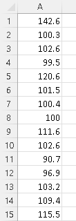
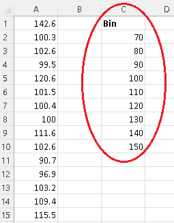
Step 1 - Organize the data sets in a column as shown below. Only the first 15 rows are shown, but there is a total of 50 data values.
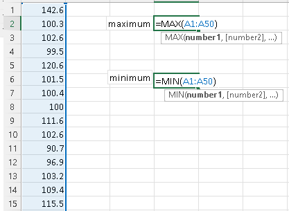
Step 2 - Use the Excel MAX and MIN functions to find the minimum and maximum of the data values:
1) Type the functions "=MAX(A1:A50)" and press "Enter"
2) then type "=MIN(A1:A50)" and press "Enter".
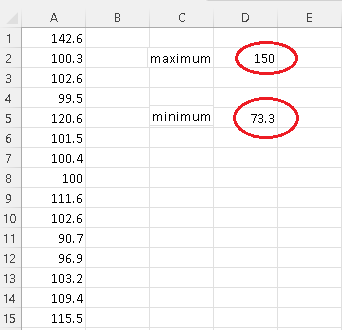
2) The results should be as follows
Step 3 - Calculate \( N \) the number of classes and their limits. The minimum, the maximum and the class width (given above) are needed.
\( N = \dfrac{Maximum - Minimum }{Class width} = \dfrac{150 - 73.3}{10} = 7.67 \)
Round the number of classes \( N \) to the nearest integer \( 8 \).
Start from the nearest "easy to read" value close to the minimum. The minimum of this data is \( 73.3 \) and it makes sense to start the classes from 70 in order to make them easy to read when we interpret the histogram.
Write the limits of the classes starting from 70 adding the class with:
70
70 + 10 = 80
80 + 10 = 90
90 + 10 = 100
100 + 10 = 110
110 + 10 = 120
120 + 10 = 130
130 + 10 = 140
140 + 10 = 150
We stop at 150 since the maximum of the data is 150 and we therefore can cover all the data values in the set.
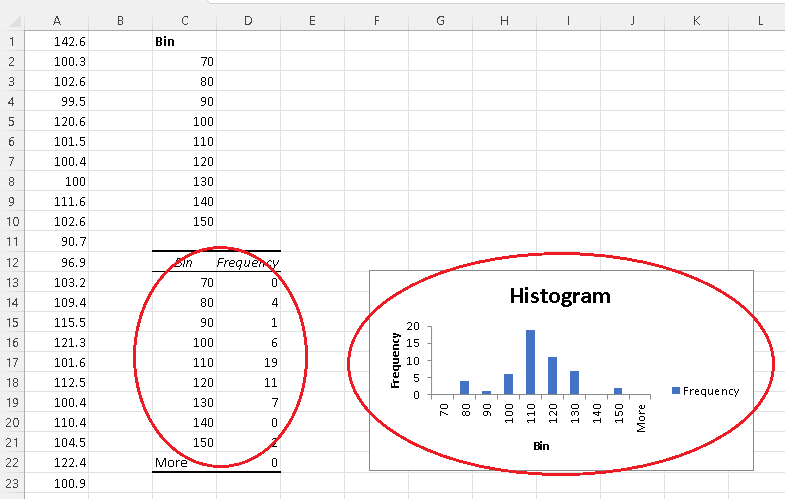
Step 4 - Use the limits calculated above including the minimum \( 70 \) to set the bin range in Excel as shown below. "Bin" is just a label.
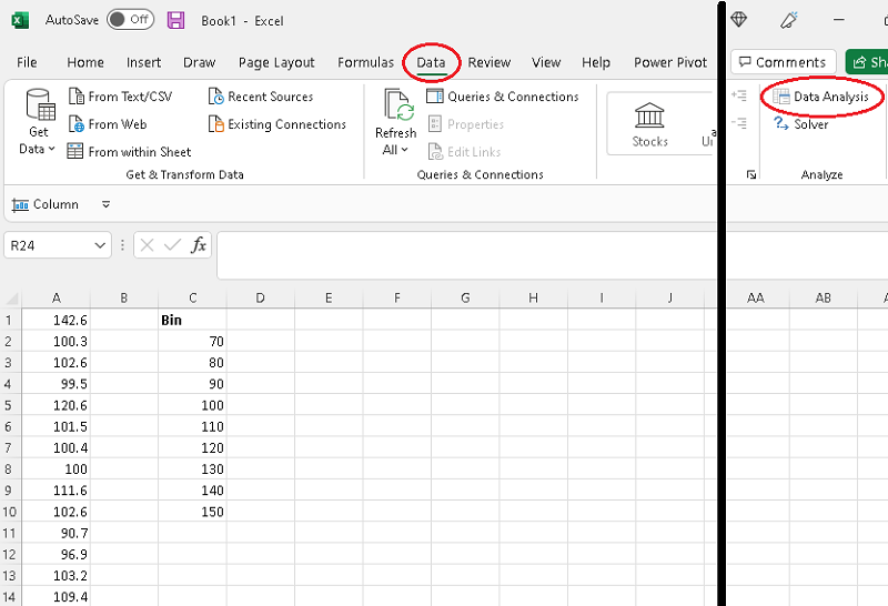
Step 5 - Press on the "Data" tab and click on "Data Analysis".
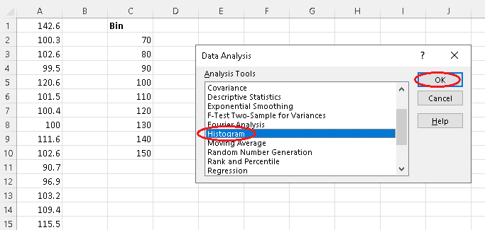
Step 6 - Select "Histogram" and click on "OK".
Step 7 - Clear Input, Bin, labels, and output areas.
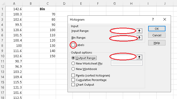
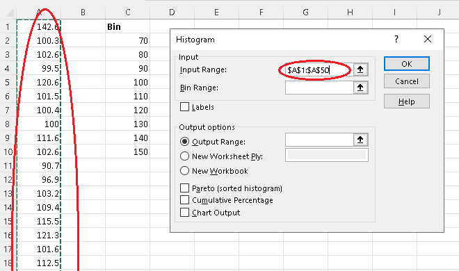
Step 8 - Click inside "Input Range" and use the mouse to select the column containing the data values. There should be 50 data values (which are not all shown) in this example.
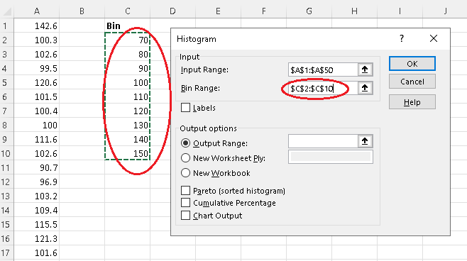
Step 9 - Click inside "Bin Range" and use the mouse to select the column containing the Bin without the label "Bin". (This is just to remember what these numbers are)
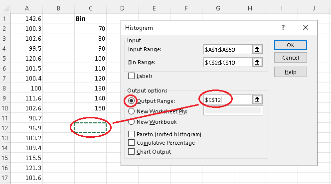
Step 10 - Select and click inside "Output Range" and use the mouse to select a cell for the output of the frequency table.
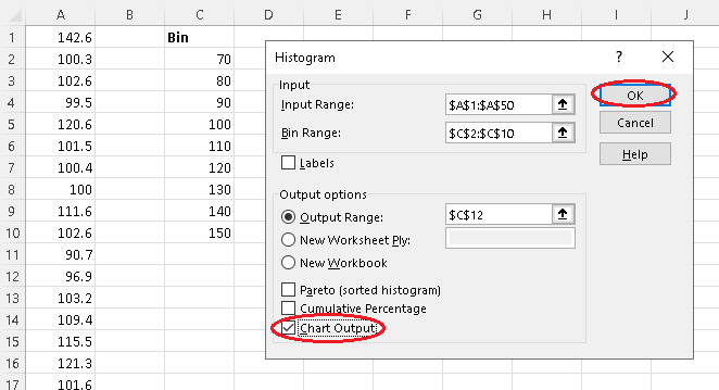
Step 11 - Select "Chart Output" and click OK.
Step 12 - Outputs of histogram done by "Data Analysis".
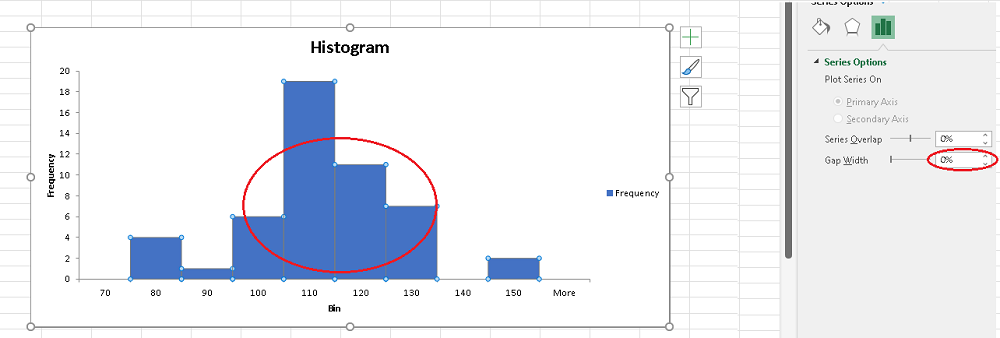
Step 13 - Click on one of the vertical bars; a panel should appear on the right where you can make the "Gap Width" equal to zero in order to eliminate any gaps between the bars to make a histogram.
Note The following steps are included to better format the histogram and make it easy to interpret and use by readers.
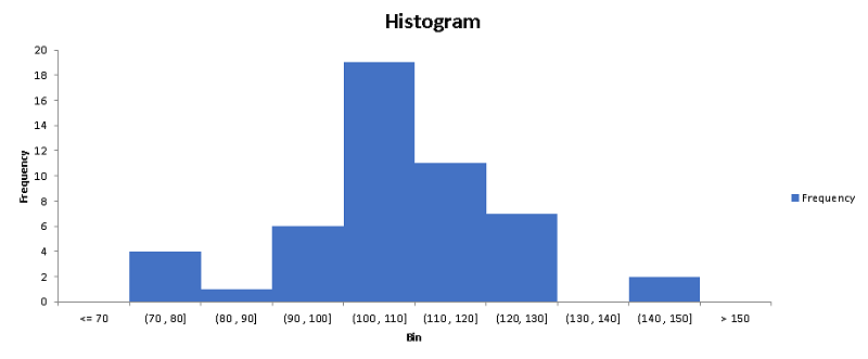
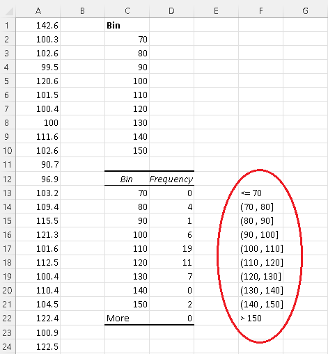
Step 14 - Rewrite classes using inequalities and intervals open on the left (value not included) and closed on the right (value included).
The first bin \( 70 \) defines a class including all data values smaller than or equal to 70, hence written as "<=70"
The second bin \( 80 \) defines a class including all data values larger than 70 smaller than or equal to 80, hence written in the interval for (70 , 80]. All the remaining bin are written in interval form except the last one.
The last bin "more" means greater than 150 and is written as ">150".
Step 15 - Double click any label on the horizontal axis (it should give a rectangle) then right click the mouse to obtain a panel where you click on "Select Data"..
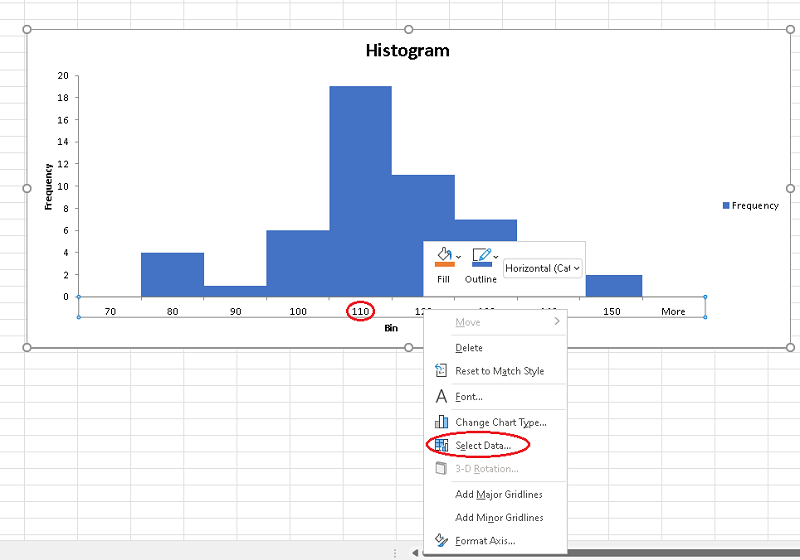
Step 16 - Click "edit" under "Horizontal (Category) Axes Labels"
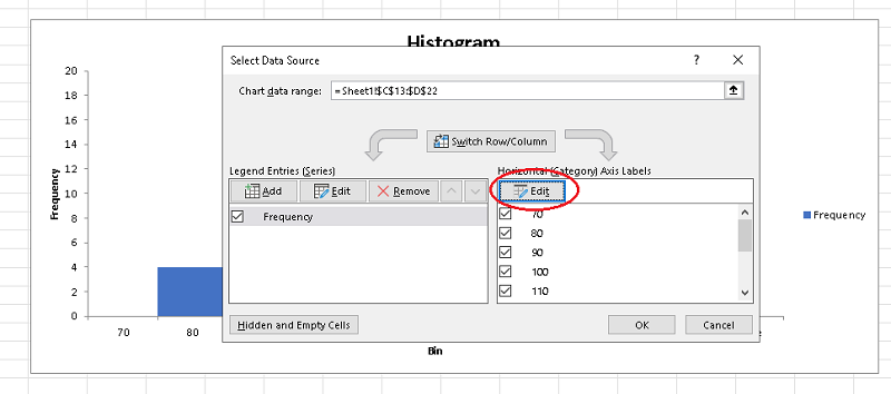
Step 17 - Firs clear the "Axis label range" (window), then click the mouse inside and select the column with the new labels
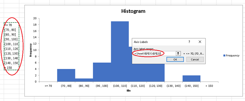
then click "OK" to end up with a histogram with a well defined classes as shown below that you can further customize to your own needs and applications.