,
Histograms of Real Life Data
Table of Contents
Histograms examples with real life data are presented. A first example is about the GDP per capita of 194 countries and territories and the second example is about the percent change of the three major stockmarket indices which are the the Dow, S&P and the Nasdaq .
Because of the large data sets involved, all the histograms are made using the steps in making a histogram using Excel and the data analysis tools.
Example 1
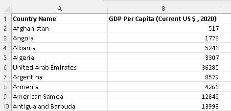
This example is about analysing the GDP (Gross Domestic Product) per capita, in US dollars, of 194 countries for the year 2020.
Because of the large amount of data, only the first 9 rows are shown below. The complete data may be downloaded for practice at GDP per capita for the year 2020 obtained from the world bank.
a) Create a histogram, with equal class widths, with the first class being (0 , 10000 ] and covers all data values.
b) Create a histogram, with equal class widths, with the first class being (0 , 5000] with the last class being (55000 , 60000]
c) Create a histogram, with equal class widths, with the first class being (0 , 1000] with the last class being (19000 , 20000]
d) Compare all three histograms. Which one gives more information as to how the countries with low GDP are distributed?
Solution to Example 1
a)
Given the first class (0 , 10000 ], the class width W is given by the difference of the upper and lower limit of the class.
W = 10000 - 0 = 10000
The limits of the next class are calculated by adding the width W to the limits of the previous class. Hence the second class is given by
(0 + 10000, 10000 + 10000] = (10000 , 20000 ]
The process is continued until all data values are covered by the classes.
Use Excel to find the largest GDP which is equal to $173688.
Hence the classes that cover all GDP values are:
(0 , 10000 ]
(10000 , 20000 ]
(20000 , 30000 ]
(30000 , 40000 ]
(40000 , 50000 ]
(50000 , 60000 ]
(60000 , 70000 ]
(70000 , 80000 ]
(80000 , 90000 ]
(90000 , 100000 ]
(100000 , 110000 ]
(110000 , 120000 ]
(120000 , 130000 ]
(130000 , 140000 ]
(140000 , 150000 ]
(150000 , 160000 ]
(160000 , 170000 ]
(170000 , 180000 ]
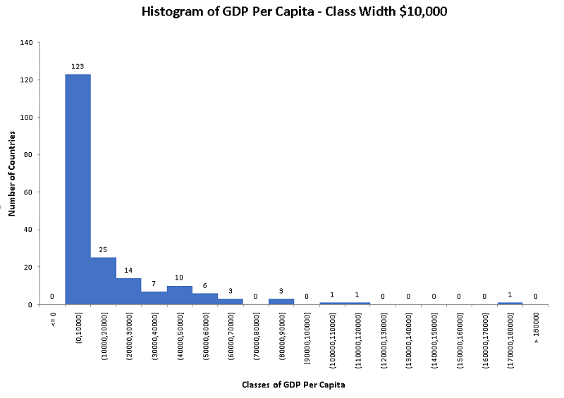
Use the upper limits of the above classes as bin and the steps in Excel data analysis tools, we obtain the following frequency table.
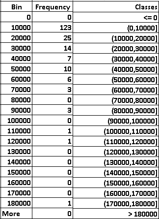
and the histogram.
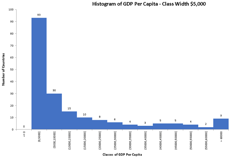
b)
In this case we are given the first class (0 , 5000] with the last class (55000 , 60000] to be included.
Given the first class (0 , 5000], the class width W is given by the difference of the upper and lower limit of the class.
W = 5000 - 0 = 5000
The limits of the are calculated by adding the width W to the limits of the previous class. Hence the second class is given by
(0 + 5000, 5000 + 5000] = (5000 , 10000 ]
The process is continued until the last class (55000 , 60000].
(0 , 5000 ]
(5000 , 10000 ]
(10000 , 15000 ]
(15000 , 20000 ]
(20000 , 25000 ]
(25000 , 30000 ]
(30000 , 35000 ]
(35000 , 40000 ]
(40000 , 45000 ]
(45000 , 50000 ]
(50000 , 550000 ]
(550000 , 60000 ]
The limits of the above classes are used as bin and following the steps in Excel data analysis tools, we obtain the following frequency table.
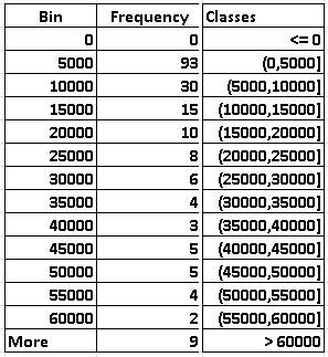
and the histogram.
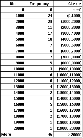
c)
In this case we are given the first class (0 , 1000] with the last class (19000 , 20000] to be included.
Given the first class (0 , 1000], the class width W is given by the difference of the upper and lower limit of the class.
W = 1000 - 0 = 1000
The limits of the next class are calculated by adding the width W to the limits of the previous class. Hence the second class is given by
(0 + 1000, 1000 + 1000] = (1000 , 2000 ]
The process is continued until the last class (19000 , 20000].
(0 , 1000 ]
(1000 , 2000 ]
(2000 , 3000 ]
(3000 , 4000 ]
(4000 , 5000 ]
(5000 , 6000 ]
(6000 , 7000 ]
(7000 , 8000 ]
(8000 , 9000 ]
(9000 , 10000 ]
(10000 , 11000 ]
(11000 , 12000 ]
(12000 , 13000 ]
(13000 , 14000 ]
(14000 , 15000 ]
(15000 , 16000 ]
(16000 , 17000 ]
(17000 , 18000 ]
(18000 , 19000 ]
(19000 , 20000 ]
Using the limits of the above classes as bin and following the steps in Excel data analysis tools, we obtain the following frequency table.
and the histogram.
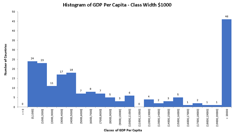
d)
The histogram in part c) with a class width of $1000 explains how GDP for is distributed for countries with lower GDP is distributed. It shows for example that 24 countries have a GDP less than or equal to $1000 and another 23 countries have a GDP greater than $1000 but less than or equal to $2000.
This detailed information cannot be obtained from the histograms of class width $10000 or $5000.
So sometimes we need to experiment with different class widths in order to obtain a histogram that helps in answering questions about the data set to be analyzed.
Example 2
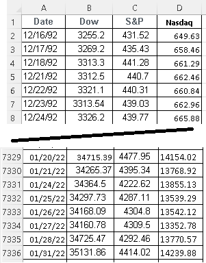
This example is about analyzing the percentage changes in the three major stock market indices: the Dow 30, S&P 500 and the Nasdaq 100 over the period 12/16/1992 to 01/31/2022.
Because of the large amount of data, only the first 8 rows and the last 8 rows of the data are shown below. The data for the whole period may be downloaded for practice at Dow, S&P and Nasdaq
a) Use any software to calculate the percentage daily changes of each index over the period 12/16/1992 to 01/31/2022.
b) Use any software to find the largest increase and decrease for each index.
c) Use any software to create a histogram for each index with class of equal to 1.
d) Which index has the highest number of days on which it increased?
e) Find the number of days on which each index increased by more than 1% and at most 2%.
Solution to Example 2
a) The percentage change p of any index on a given day is calculated as follows:
\( p = 100 \times \dfrac{\text{Value of Index on a given day - Value of Index on the previous day} }{ \text{Value of Index on the previous day} } \)
Excel was used to calculate the percentage changes of the three indices using Excel functions.
Dow: type "=100*(B3 - B2)/B2" in cell E3 and copy the formula down the column
S&P: type "=100*(C3 - C2)/C2" in cell F3 and copy the formula down the column
Nasdaq: type "=100*(D3 - D2)/D2" in cell G3 and copy the formula down the column
You should obtain the percent changes in columns E, F and G as follows:
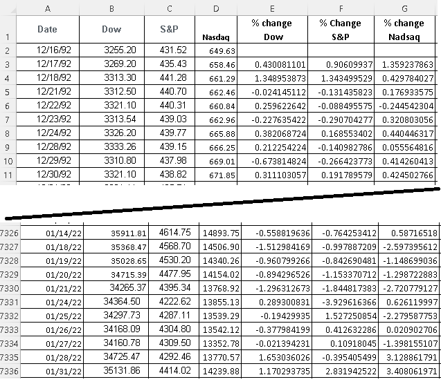
Because of the large data set, we have shown the first 10 and last 10 days (rows in Excel), however the complete data with the percent changes for all three indices may be downloaded at
percent change of Dow, S&P and Nasdaq over the period 12/16/1992 to 01/31/2022 and used for practice.
b)
We use the functions "=max()" and "=min()" in Excel in order to find the largest increase and decrease. Type each of the functions shown below and press "Enter".
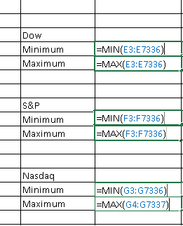
The results are shown below: the largest increase in the maximum and the largest decrease is the minimum.
c)
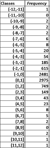
1 - Frequency Distribution and Histogram of the Percent Changes in the S&P
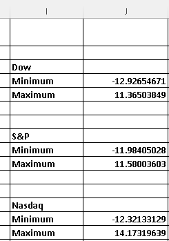
Minimum (largest decrease) = -11.98405028
Maximum(largest increase) = 11.58003603
The classes, on the left column, with width 1 covering all values of the S&P are as follows.
The bins, on the right column, to be used in Excel to find the frequencies are the upper limits of the classes.
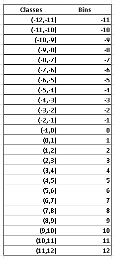
Use the bins, above, in the steps in "making a histogram using Excel" to obtain the frequencies and the histogram shown further down.
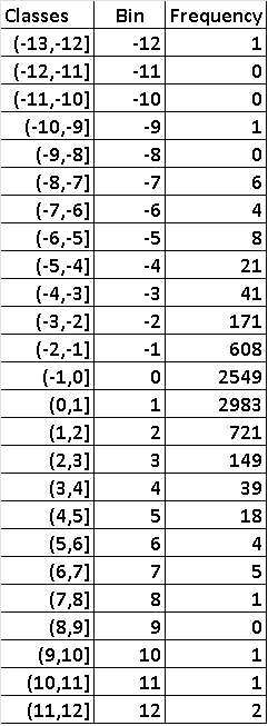
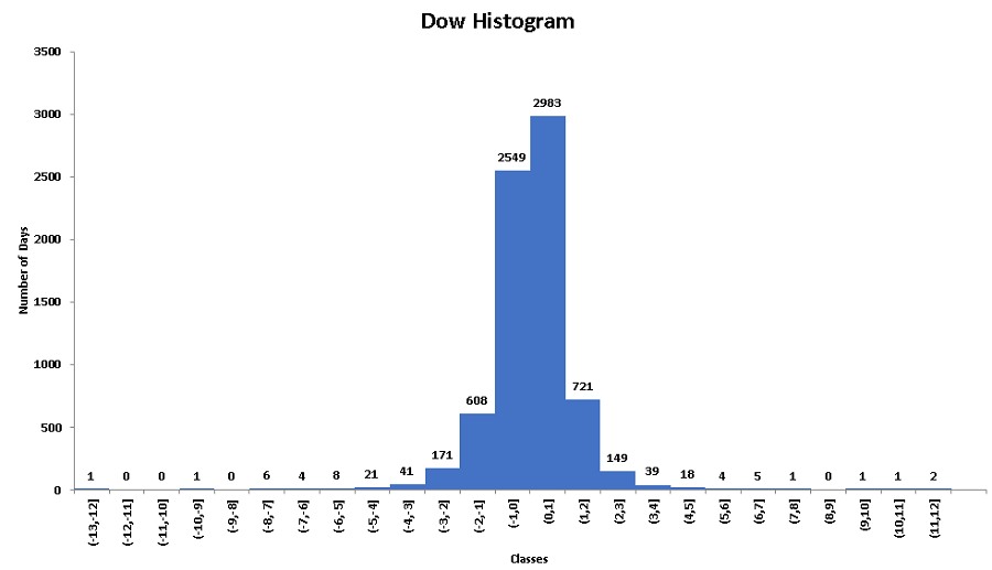
2 - Frequency Distribution and Histogram of the Percent Changes in the Dow
Minimum (largest decrease) = -12.92654671
Maximum(largest increase) = 11.36503849
The classes with width 1 (left column) covering all values, the bins to be used in Excel (middle column) and the frequency (number of days) distribution of the Dow are as shown below.
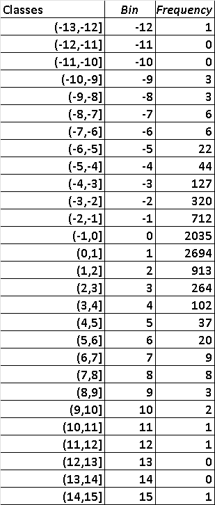
3 - Frequency Distribution and Histogram of the Percent Changes in the Nasdaq
Minimum (largest decrease) = -12.32133129
Maximum(largest increase) = 14.17319639
The classes with width 1 (left column) covering all values, the bins to be used in Excel (middle column) and the frequency (number of days) distribution of the Nasdaq are as shown below.
d)
Using the histograms, all classes on the right of the class (-1 , 0], correspond to an increase since they include all positive values. Hence, for each index, we add the number of days (vertical axis) corresponding to all classes the right of the class (-1 , 0]
1 - S&P: 2975 + 749 + 149 + 43 + 23 + 8 + 5 + 2 + 0 + 2 + 1 + 1 = 3958 days on which the S&P increased.
2 - Dow: 2983 + 721 + 149 + 39 + 18 + 4 + 5 + 1 + 0 + 1 + 1 + 2 = 3924 days on which the Dow increased.
3 - Nasdaq: 2694 + 913 + 264 + 102 + 37 + 20 + 9 + 8 + 3 + 2 + 1 + 1 + 0 + 0 + 1 = 4055 days on which the Nasdaq increased.
Hence in the period extending from 12/16/1992 to 01/31/2022, the Nasdaq had the highest number of days on which it increased.
e)
An increase by more than 1% and at most 2% corresponds to the class (1 , 2]. Hence the number of days in this class, for each index are obtained from the histograms.
1 - S&P: 749 days on which the S&P increased more than 1% and at most 2% .
2 - Dow: 721 days on which the Dow increased more than 1% and at most 2%.
3 - Nasdaq: 913 days on which the Nasdaq increased more than 1% and at most 2% .
More References and links
- Histograms for Grouped Data
- Desriptive Statistics and Data Presentation
- Reading Histograms - Examples With Solutions
- Data Analysis in Excel