,
Histograms for Grouped Data
Table of Contents
Histograms to represent grouped data graphically are presented with examples and their solutions.
There are several application software that can group data and make histograms. However, in example 1 , all the steps to group data are shown in order to fully understand the process. In example 2, we show how to make a frequency distribution and in example 3 the histogram of the grouped data is made. More comprehensive examples are also included.
More examples are done using Excel to make histograms .
Histograms of Real Life Data are also included.
Grouped Data in Classes
Large amount of data may be grouped into classes in order to be able to interpret and draw conclusion and even make decisions.
Example 1
The 50 data values shown below are the lengths, in centimeters, of 50 tools produced by a company.
142.6 , 100.3, , 102.6, , 99.5, , 120.6, , 101.5, , 100.4, , 100.0, , 111.6, , 102.6,
, 90.7, , 96.9 , 103.2 , 109.4 , 115.5 , 121.3 , 101.6 , 112.5 , 100.4 , 110.4
,
104.5 , 122.4 , 100.9 , 122.5 , 150.0 , 104.7 , 112.7 , 112.5 , 121.5 , 123.7
,
102.5 , 110.2 , 113.6 , 121.3 , 115.5 , 109.4 , 103.2 , 96.9 , 90.7 , 84.6
,
78.8 , 73.3 , 109.3 , 111.5 , 113.7 , 79.0 , 107.6 , 109.3 , 103.8 , 78.0
The above data may be downloaded and used for practice at data for histograms .
a) Order the data from the smallest to the largest value and find the smallest length and largest length of the tools produced?
b) What is the range R of the lengths?
c) Use a class width of 10 to group the data values into classes.
Solution to Example 1
a)
We can order the data using any software to make it easy to group data into classes. Here we present the above data classified in ascending order using Excel.
73.3 , 78.0 , 78.8 , 79.0 , 84.6 , 90.7 , 90.7 , 96.9 , 96.9 , 99.5
,
100.0 , 100.3 , 100.4 , 100.4 , 100.9 , 101.5 , 101.6 , 102.5 , 102.6 , 102.6
,
103.2 , 103.2 , 103.8 , 104.5 , 104.7 , 107.6 , 109.3 , 109.3 , 109.4 , 109.4
,
110.2 , 110.4 , 111.5 , 111.6 , 112.5 , 112.5 , 112.7 , 113.6 , 113.7 , 115.5
,
115.5 , 120.6 , 121.3 , 121.3 , 121.5 , 122.4 , 122.5 , 123.7 , 142.6 , 150.0
The smallest length is equal to 73.3 centimeters.
The largest length is equal to 150.0 centimeters.
b)
The range R of the lengths is given by
Range = Largest length - Smallest length = 150.0 - 73.3 = 76.7
c)
We now need the classes and the corresponding frequencies
The number of classes can be anywhere between 5 and 20.
The smallest length is equal to 73.3. We can use this value, however we want to make the classes easy to read and to graph later. So we choose a
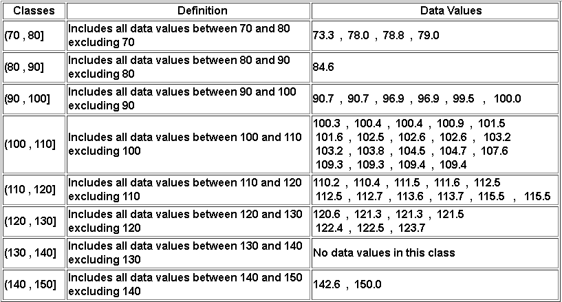
whole number less than or equal to the smallest length, 73 for example. Better, we can start from the smallest value 70 and define our classes, using interval notation, as follows:
The first class can be defined as follows
(70 , 80] : this class will include all lengths between 70 and 80, excluding 70
The limits of the next class are found by adding the given class width which is equal to 10 to the limits of the previous class. hence the second class is defined by
second class: (70 +10 , 80+10] which gives (80 , 90] : this class will include all lengths between 70 and 80, excluding 70
third class: (80 +10 , 90+10] which gives (90 , 100].
fourth class: (90 +10 , 100+10] which gives (100 , 110] and so on.
We continue creating classes until we cover all possible data values.
Once we define all classes that cover all the data values, we list the data values in each class as shown in the right column of the table below.
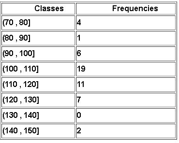
Frequency Distribution
Example 2
Make a frequency distribution table using the table in example 1 above.
Solution to Example 2
The frequency corresponding to a class is equal to the number of data values in that class. Count the number of data values in each class in table in example 1 above to make the frequency table as follows:
Histogram for Grouped Data
A histogram is a graphical representation of data grouped into classes. The bars of the histogram have no gaps between them because the classes used to group the data have no
gaps between them in order to include all possible values of the data.
Example 3
Make a histogram of the classes and their frequencies in example 2.
Solution to Example 3
The histogram is a two dimensional graph with the frequencies on the vertical axis and the classes on the horizontal axis. Using the frequency table in example 2, the histogram of the classes in example 2 is shown below.
A histogram is easily interpreted: for example, we can see that 19 data values are larger than 100 and smaller than or equal to 110.

More Examples with Solutions
The following examples use larger data sets and therefore software to make histograms are needed. The frequency distributions and histograms of examples are made using the steps
described in Excel to make histograms. To use Excel to make histograms, you need the data set and the bins which are defined below using the classes.
Example 4
The time, in minutes, spent by 60 customers in a mall is as follows:
70,55,56,55,59,59,55,55,59,56,52,54,56,60,61,62,56,60,55,59,68,63,56,63,72,57,60,60,63,63,56,59,65,62,66,63,67,54,52,50,48,46,58,59,60,48,58,58,57,48,59,60,61,61,60,59,62,63,64,62
The above data may be downloaded at time at Mall data and used for practice.
a) Make a histogram with the first class being (40 , 45] and classes with constant width.
b) Use the histogram to find the percentage of the total number of customers who spent at most 60 minutes in the mall.
c) Find the percentage of the total number of customers who spent more than 55 minutes but 70 minutes or less.
Solution to Example 4
a)
We first need to find the minimum and maximum data values in the given data set. Using "=max()" and "=min()" Excel functions or any other method, we find:
Minimum = 46 , Maximum = 72.
The class width W is constant and is given by the difference of the limits of the given class (45 , 50].
\( W = 50 - 45 = 5 \)
We now need to define the bins which should start at 40 then add the width W = 5 till with that last bin being equal to or greater than the maximum data value..
Bins to be used in Excel are defined from the class limits as follows:
45 is the limit of the first class
45 + 5 = 50
50 + 5 = 55
55 + 5 = 60
60 + 5 = 65
65 + 5 = 70
70 + 5 = 75
Using the bins above and following the steps in the use Excel to make histograms , we end up with the bin table including the frequencies shown below.
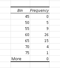
Rewrite the bin table as a frequency table.
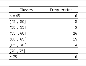
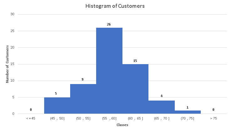
The histogram of the grouped data is shown below.
b)
The number of customers who spent at most 60 minutes in the mall are in the classes with intervals: (45 , 50] , (50 , 55] and (55 , 60] whose number of customers are 5, 9 and 26 respectively.
The total number of customers who spent at most 60 minutes is given by the sum: 5 + 9 + 26 = 40
The percentage of customers who spent at most 60 minutes is given by: \( \dfrac{40}{60} \approx 67\% \)
c)
The number of customers who spent more than 55 minutes but 70 minutes or less correspond to the classes with intervals: (55 , 60] , (60 , 65] and (65 , 70] whose number of customers are 26, 15 and 4 respectively.
The total number of customers who spent more than 55 minutes but 70 minutes or less is given by the sum: 26 + 15 + 4 = 45
The percentage of customers who spent more than 55 minutes but 70 minutes or less is given by: \( \dfrac{45}{60} = 75\% \)
Example 5
The scores of a test taken by 100 students are shown below.
56,56,63,75,60,59,65,76,51,67,68,35,40,30,73,72,42,56,83,67,76,51,26,48,38,53,71,66,82,67,66,90,72,80,85,87,31,57,69,77,77,53,79,97,70,81,75,81,55,35,25,51,64,68,73,47,36,
67,90,63,98,79,67,67,60,78,48,49,63,38,87,44,75,66,94,94,50,69,62,78,76,77,65,65,47,57,42,79,49,61,26,66,18,85,55,96,29,92,57,65
The above data may be downloaded at scores and used for practice.
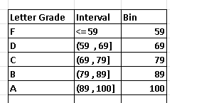
We need to classify students by their letter grades A, B, C, D or F according to the following table:
| Score | Letter Grade |
| Greater than or equal to 90 | A |
| Greater than or equal to 80 and less than 90 | B |
| Greater than or equal to 70 and less than 80 | C |
| Greater than or equal to 60 and less than 70 | D |
| less than 60 | F |
a) Use the classes defined above to determine the frequency distribution and make a histogram of the scores.
b) How many students failed the test(letter grade F)?
c) How many students obtained an A in the test?
d) How many students obtained an A or a B in the test?
e) What is the percentage of students who passed the test by scoring 60 or more?
Solution to Example 5
a)
The given latter grades may be used to define the classes in the middle column. The bins to be used in Excel are defined by the upper limit of the classes and are in the right column.
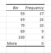
Using the given data of the scores and the bins in the above table in the steps to use Excel to make histograms , we obtain the table of frequencies below.
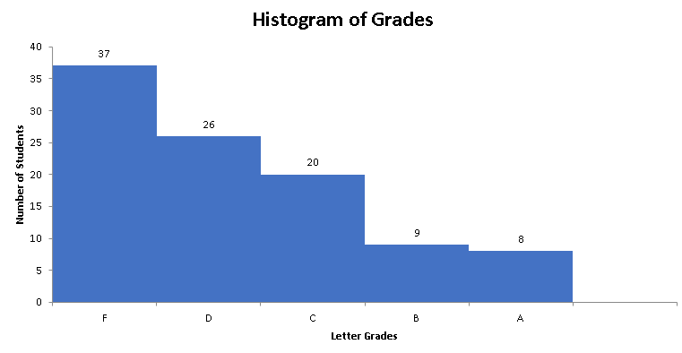
and the histogram below.
b)
The frequency corresponding to bin is equal to the number of student who scored an F and therefore failed the test. Hence the number of students who students failed is equal to 37
c)
The number of students who scored an A is equal to the frequency corresponding to bin 100 and is equal to 8.
d)
The number of students who scored an A or a B is equal to the sums of the frequencies corresponding to bin 100 and 89 is equal to: 8 + 9 = 17
e)
The total number of students who passed by scoring 60 or more is is equal to the total number of students who failed (found in part b) subtracted from the total number of students and is given by: 100 - 37 = 63.
In percentage: \( \dfrac{63}{100} = 63\% \) of students passed the test
Example 6
The average pageview durations, in seconds, of 200 pages in the website www.analyzemath.com are shown below.
2.38,0.27,2.25,1.26,2.39,3.11,1.02,4.24,2.19,1.16,1.48,2.37,3.03,4.11,0.38,3.1,4.55,1,1.44,3.25,0.48,1.16,3.53,3.02,3.48,2.26,
3.55,1.56,2.3,3.38,3.43,2.07,4.54,2.17,1.17,0.4,5.31,4.14,3.36,3.48,3.59,1,1.32,0.42,2.36,4.3,3.56,3.19,0.5,5.1,4.05,3.27,2.59,3.56,
3.22,2.35,2.21,4,3.18,3.49,4.12,2.02,2.06,2.38,2.29,6.26,0.59,4.58,2.44,4.01,2.08,3.13,3.23,1.35,3.14,1.06,7.11,5.12,1.11,1.46,0.57,3.38,2.47,4.2,3.59,
2.07,3.02,3.32,2.06,0.27,2.19,4.57,3.43,4.39,4.3,4.07,1.31,2.37,1.32,2.3,0.52,3.21,2.36,0.08,1.19,2.16,2.5,2.37,4.45,2.18,2.27,3.46,3.52,3.58,2.12,5.22,
2.51,4.15,4.01,2.09,3.31,0.39,3.03,1.44,4.49,2.27,2.22,1.46,4.18,3.29,1.58,3.05,1.57,4.16,2.44,0.38,2.13,3.41,4.3,1.59,7.22,6.57,1.06,4.15,3.13,2.45,3.3,
1.51,4.16,2.48,0.44,4.17,3.51,3.44,3.52,2.29,4.26,4.02,2.48,1.5,2.47,2.01,2.2,3.33,1.53,3.36,1.01,3.05,3.17,3.52,2.19,2.07,1.3,2.49,2.28,4.04,2.53,4.38,1.46,3.1,
1.14,3.39,2.51,4.15,0.35,2.51,4.39,2.13,5.5,1.04,2.14,1.07,3.34,5.15,2.04,7.02,0.45,3.33,3.28,0.59
The above data may be downloaded at average pageview durations and used for practice.
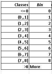
a) Organize the above data into classes of width 1 second starting from the class (0 , 1] and define the bins to be used in Excel to make a histogram.
b) Make a histogram of the above data.
c) How many pages have an average pageview duration of more than 2 seconds?
d) What percentage of the total number of pages have an average pageview duration of more than 3 seconds and less than or equal to 5 seconds?
Solution to Example 6
a) Starting from the first class (0 , 1], we obtain the remaining classes by adding the class width, which is given and is equal to 1, to the previous class.
First class: (0 , 1]
second class: (0 +1 , 1 + 1] = (1 , 2]
Third class: (1+1 , 2 + 1] = (2 , 3]
Fourth class: (2 +1 , 3 + 1] = (3 , 4]
Fifth class: (3 +1 , 4 + 1] = (4 , 5]
Sixth class: (4 +1 , 5 + 1] = (5 , 6]
Seventh class: (5 +1 , 6 + 1] = (6 , 7]
Eighth class: (6 +1 , 7 + 1] = (7 , 8]
The bins are given by the upper limit of the classes as shown in the table below.
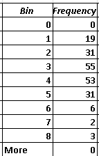
Using the given data of the scores and the bins in the above table in the steps to use Excel to make histograms , we obtain the table of frequencies below.
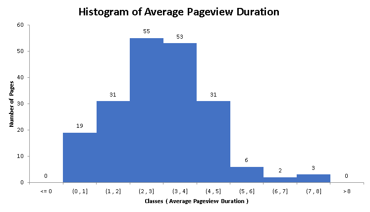
b)
The histogram corresponding to the above data is shown below.
c)
The classes including average pageview duration of more than 2 seconds are: (2 , 3] , (3 , 4] , (4 , 5] , (5 , 6] , (6 , 7] , (7 , 8].
Add the number of pages (frequencies) for all the above classes: 55 + 53 + 31 + 6 + 2 + 3 = 150
Hence, 150 pages have an average pageview duration of more than 2 seconds.
d)
The classes corresponding to pages with an average pageview duration of more than 3 seconds and less than or equal to 5 seconds are: (3 , 4] , (4 , 5]
Add the number of pages (frequencies) of these two classes: 53 + 31 = 84
Hence, 84 have have an average pageview duration of more than 3 seconds and less than or equal to 5 seconds.
The percentage of the pages having an average pageview duration of more than 3 seconds and less than or equal to 5 seconds is given by: \( \dfrac{84}{200} = 42\%\)
More References and links
- Desriptive Statistics and Data Presentation
- Reading Histograms - Examples With Solutions
- Data Analysis in Excel