Correlation Problems with Real Life Data
Table of Contents
Correlation problems with real life data are presented along with their solutions.
Six problems are presented where the correlations between:
the average time spent on website pages and their average engaged time in the website http://www.analyzemath.com/index.html,
the wheat production and exports worldwide,
the nasdaq index and Apple stock prices,
the dow, s&p and nasdaq indices,
the gdp per capita, the spending on health and life expectancy worldwide,
and the Generated electricity and CO2 emission worldwide are studied using real life data downloaded from the websites http://www.analyzemath.com/index.html, http://data.worldbank.org/, http://www.who.int/, http://ca.finance.yahoo.com/ and generated using Excel sheets.
Problems with Solutions
Problem 1
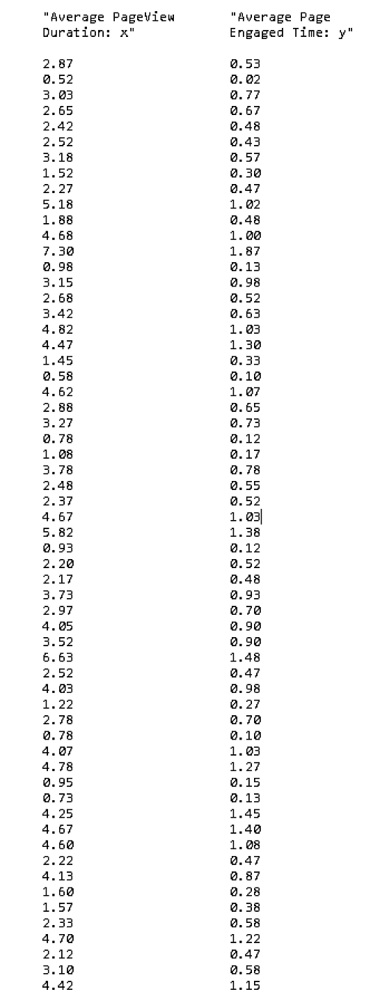
The data set in the table below represents the total "average pageview duration (x)" and the "average page engaged time (y)" in seconds for 60 pages in the website www.analyzemath.com.
The above data could be downloaded at
Average Engaged Time and copied and pasted in either Excel, Google sheets or LibreOffice and used.
a) Use any software applications such as Google Sheets, Excell, LibreOffice to produce a scatter plot of y versus x. Would you expect the correlation between the "average pageview duration (x)" and the "average page engaged time (y)" to be close to 1, -1 or 0?
b) Use any software to compute the sums of squares \( SS_x \), \( SS_y \) and cross products \( SS_{xy} \)
c) Calculate the correlation \( r \) using the correlation formula \( r = \dfrac{SSxy}{\sqrt {SSx \cdot SSy}} \) and the sums calculated in part b).
d) Calculate the correlation \( r \) using excel and compare it to the value calculated in part c).
Solution Problem 1
a)
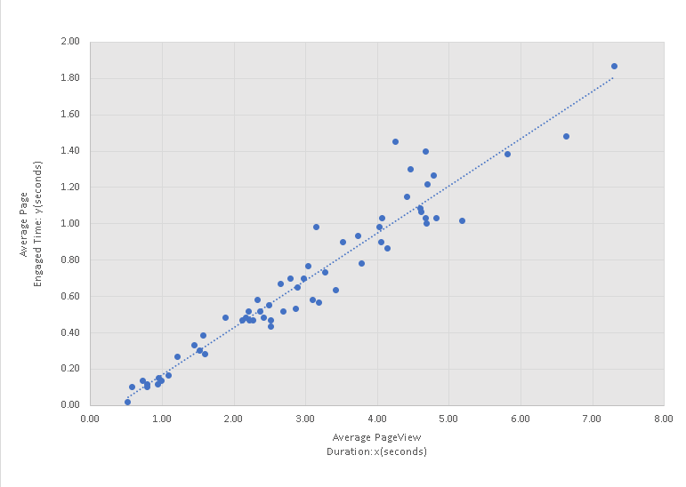
Excel was used to make a scatter plot of "average page engaged time (y)" versus the total "average pageview duration (x)" as is shown below. Note that the "average engaged time" increases as the "average pageview duration" increases and we would expect a correlation close to 1.
b)
Excel was used to calculate the sums (in red) as shown on the table below
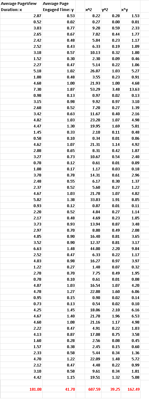
There are 60 pairs of data values \( (x_i,y_i) \), hence \( m = 60 \).
From the above table, we have the following sums:
\( \sum x_i = 181.08 \), \( \quad \sum y_i = 41.70\), \( \quad \sum x_i y_i = 162.49\),
\( \sum x_i^2= 687.59\) , \( \quad \sum y_i^2= 39.25\)
Using the formulas for the sums \( SSx \) , \( SSy \) and \( SS{xy} \) , we have
\( SSx = \sum x_i^2 - \dfrac{(\sum x_i)^2}{m} \\
=
687.59 - \dfrac{181.08^2}{60} = 141.0906 \)
\( SS_y = \sum y_i^2 - \dfrac{(\sum y_i)^2}{m} \\
= 39.25 - \dfrac{41.70^2}{60} = 10.2685 \)
\( SS_{xy} = \sum x y - \dfrac{\sum x \sum y}{m} \\
=162.49 - \dfrac{181.08 \times 41.70}{60} \\
= 36.6394
\)
c)
The correlation between \( x \) and \( y \) is given by the formula
\( r = \dfrac{SSxy}{\sqrt {SSx \cdot SSy}} \\
= \dfrac{36.6394}{\sqrt {141.0906 \cdot 10.2685 }} \\
= 0.9625 \)
d)
The results of the calculation of the correlation using Excel is
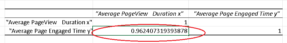
\[ r = 0.962407319393878 \]
Compare to the value of the correlation coefficient \( r \) found in part c), the small difference is due to the rounding errors.
Problem 2
The table below is the total world wheat production (x) and export (y) in million metric tons from 1962 to 2020 (61 years).(Data from The world bank at http://data.worldbank.org/).
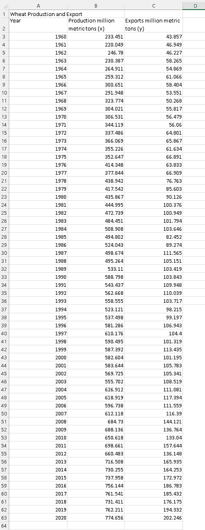
The above data may be downloaded at
Wheat Production and Exports and may be downloaded in either Excel, Google sheets or LibreOffice and used.
a) Use any software applications such as Google Sheets, Excell, LibreOffice .. to make a scatter plot of y versus x.
b) Use any software to find the sums of squares \( SS_x \), \( SS_y \) and cross products \( SS_{xy} \)
c) Calculate the correlation using the formula and the sums calculated in part b).
d) Calculate the correlation \( r \) using excel .
Solution Problem 2
a)
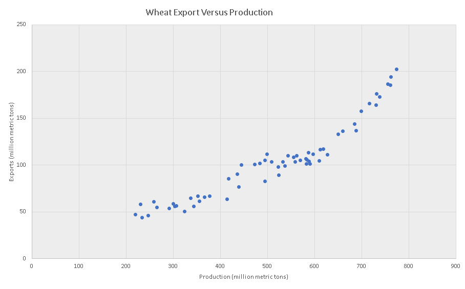
b)
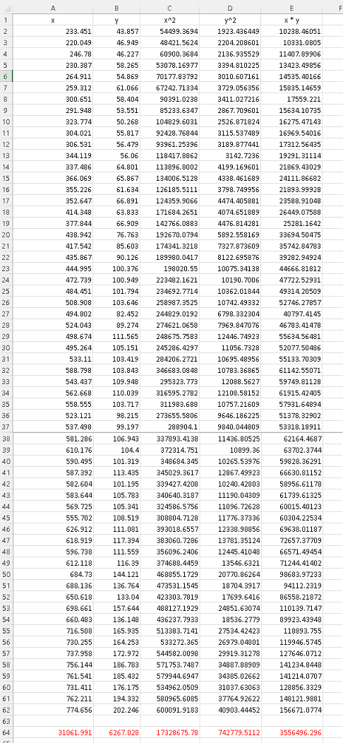
There are 61 pairs of data values \( (x_i,y_i) \), hence \( m = 61 \).
Excel was also used to do all the calculations of sums (red):
\( \sum x_i = 31061.991 \) , \( \sum y_i = 6267.028 \),
\( \sum x_i y_i = 3556496.296 \) , \( \sum x_i^2 = 17328675.78 \) , \( \sum y_i^2= 742779.5112 \)
\( SSx = \sum x_i^2 - \dfrac{(\sum x_i)^2}{m} \\
=
17328675.78 - \dfrac{31061.991^2}{61} = 1511507.17534 \)
\( SS_y = \sum y_i^2 - \dfrac{(\sum y_i)^2}{m} \\
= 742779.5112 - \dfrac{6267.028^2}{61} = 98916.56115 \)
\( SS_{xy} = \sum x y - \dfrac{\sum x \sum y}{m} \\
= 3556496.296 - \dfrac{31061.991 \times 6267.028}{61} \\
= 365244.37251
\)
c)
The correlation between \( x \) and \( y \) is given by
\( r = \dfrac{SSxy}{\sqrt {SSx \cdot SSy}} \\
= \dfrac{365244.37251}{\sqrt {1511507.17534 \cdot 98916.56115 }} \\
= 0.9446 \)
d)
The results of the calculation of the correlation using Excel is
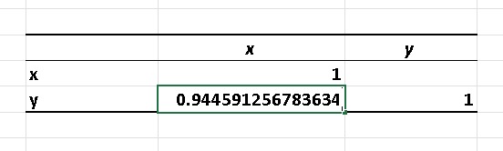
The correlation is equal to:
\[ r = 0.944591256783634 \]
the small difference between correlation coefficient \( r \) given by Excel and the one found in part c), is due to the rounding errors.
Problem 3
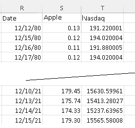
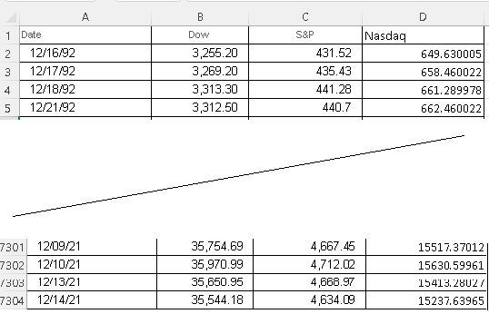
The first four and the last four rows of the stock price of Apple shares and the Nasdaq index from 1980 to 2021 are shown below.(Nasdaq Data from yahoo and Apple share price generated through Excel sheets).
The complete data set of 10340 rows used in this study may be downloaded at
Apple Nasdaq and used for more practice.
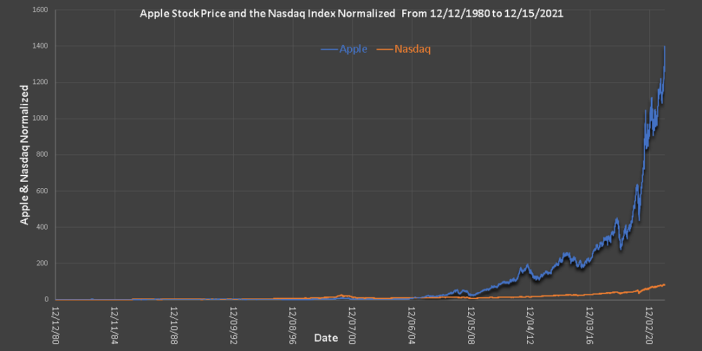
a) Normalize Apple stock price by dividing all prices by the stock price on the 12/12/1980. Normalize the Nasdaq index by dividing all values of the index by its value on the 12/12/1980. Plot both Apple stock price and the Nasdaq index in normalized form.
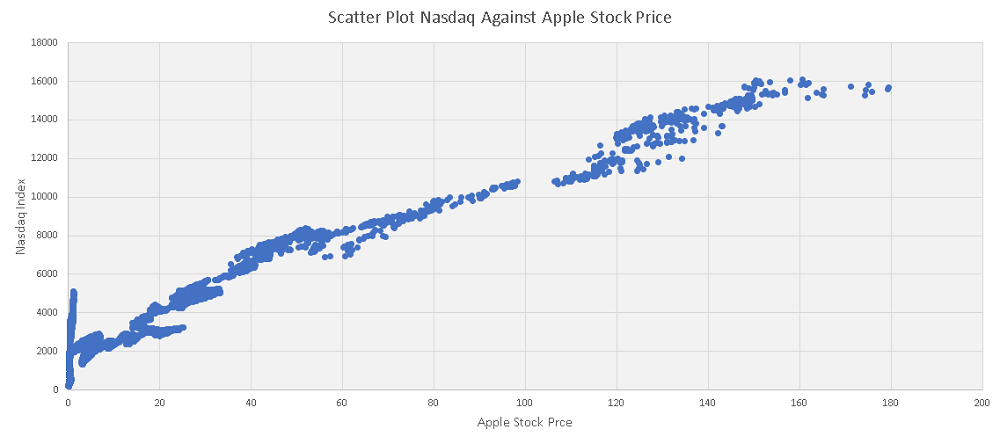
b) Use any software to make a scatter plot of Apple stock price against the Nasdaq index and a trend line.
d) Calculate the correlation \( r \) using any software.
Solution Problem 3
a)
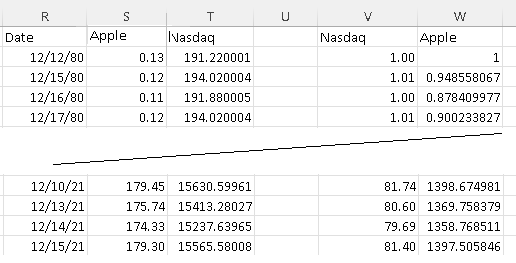
The first four and the last four rows of the data used in this study, with columns V and W in normalized form, are shown below
The Apple stock price and the Nasdaq index are plotted below from 12/12/1980 to 12/15/2021 and we can see that both have increased.
However, because of the way the data was normalized, it is easy to seen from the table and the graph below the increase or decreases over that period of time.
By 12/15/2021, Apple stock price presented a 1397 fold increase while the Nasdaq presented 81 fold increase, hence the Apple stock price increased at a higher rate.
b)
The scatter plot of the Nasdaq against Apple stock price is shown below. Although both the Nasdaq and Apple stock price increase with time, because their rates of change over time are not the same, the scatter plot is not linear as shown below.
c)
The correlation was calculated using Excel and the results are shown below.
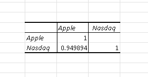
The correlation between
\( r = 0.949894 \)
Problem 4
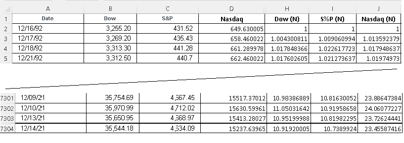
The first four and the last four rows of the Dow, S&P and the Nasdaq index from 1992 to 2021 are shown below.(All Data from yahoo).
The complete data set of 7303 rows may be downloaded at
Dow, S&P, Nasdaq and may be copied, pasted and used.
a) Normalize the values of all three indices by dividing the values in each column by the values in the first row on the 12/16/1992. Plot all three indices in normalized form over the time.
b) Use any software to make a scatter plot of each pair of indices.
d) Use any software to calculate the correlation \( r \) of each pair of indices.
Solution Problem 4
a)
The first four and the last four rows of the data used in this study, with columns H, I and J in normalized form, are shown below
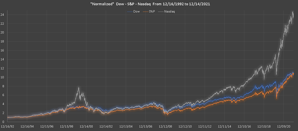
Below is shown the graphs, from 12/16/1992 to 12/14/2021, of all three indices and they all increased over that period of time however the rates of increase are not the same.
b)
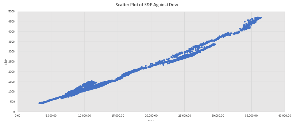
The scatter plot of the S&P against the Dow is shown below; it is close to linear because the rate of increases over time are close as shown in the graph above.
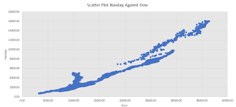
The scatter plot of the Nasdaq against the Dow is shown below; it is not close to linear because the rate of increases of the Nasdaq and the Dow , over time, are different as shown in the graph above.
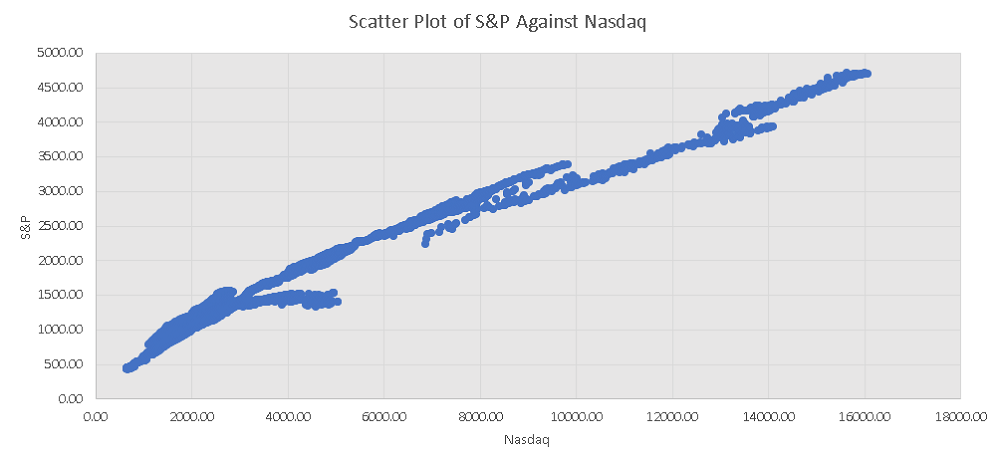
The scatter plot of the S&P against the Nasdaq is shown below; it is not close to linear because the rate of increases of the S&P and the Nasdaq , over time, are different as shown in the graph above.
c)
The correlation were calculated using Excel and the results are shown below.
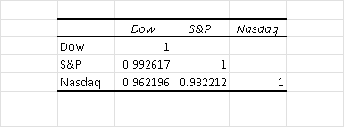
The correlations are:
Correlation between the Dow and the S&P is equal to: 0.992617
Correlation between the Dow and the Nasdaq is equal to: 0.962196
Correlation between the S&P and the Nasdaq is equal to: 0.982212
The strongest correlation is between the Dow and the S&P and this shows from the graph over time above.
The weakest correlation is between the Dow and the Nasdaq and this also shows from the graph over time above.
Problem 5
In the table below are shown the GDP per capita, the spending on health per capita and the average life expectancy in the world from 2000 to 2018 are shown below.(All Data from http://www.who.int/ and data.worldbank.org).
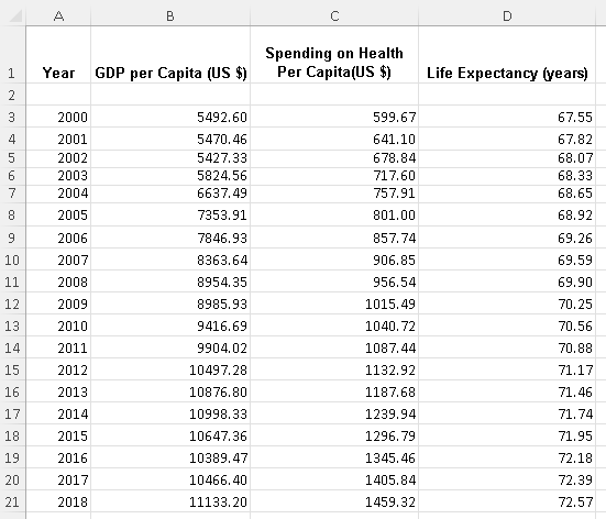
The complete data set of 7303 rows may be downloaded at
life expectancy, gdp and health spending and may be copied, pasted and used.
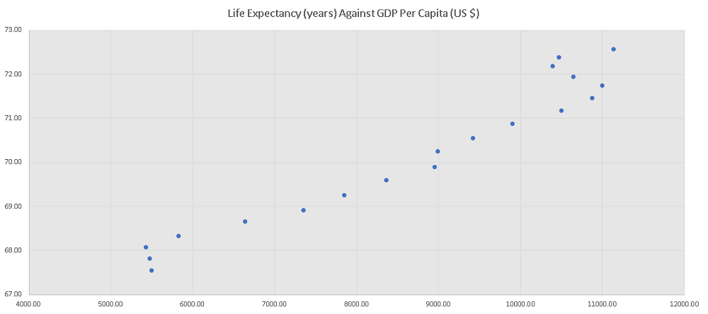
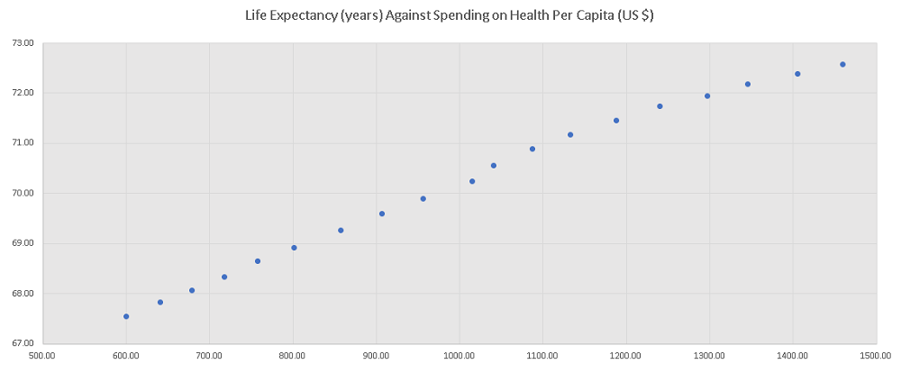
a) Use any software to make a scatter plot of life expectancy against the gdp per capita and a scatter plot of life expectancy against health spending per capita.
b) Use any software to calculate the correlation between life expectancy and the gdp per capita and the correlation between life expectancy and health spending per capita. Does life expectancy depends strongly on the gdp or spending on health per capita?
Solution Problem 5
a)
Excel was used to generate the scatter plots below.
The scatter plot of life expectancy against the gdp is shown below and the graph is not close to linear.
The scatter plot of life expectancy against the spending on health is shown below and the graph is close to linear.
c)
The results of the correlations calculated , using Excel , are shown below.
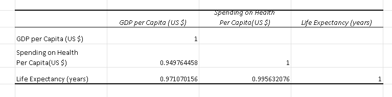
The correlations are:
Correlation between life expectancy and health spending is equal to: 0.995632076
Correlation between life expectancy and the GDP is equal to: 0.971070155
Because the correlation between life expectancy and health spending is close to 1, therefore life expectancy depends on how much you spend health per capita.
Problem 6
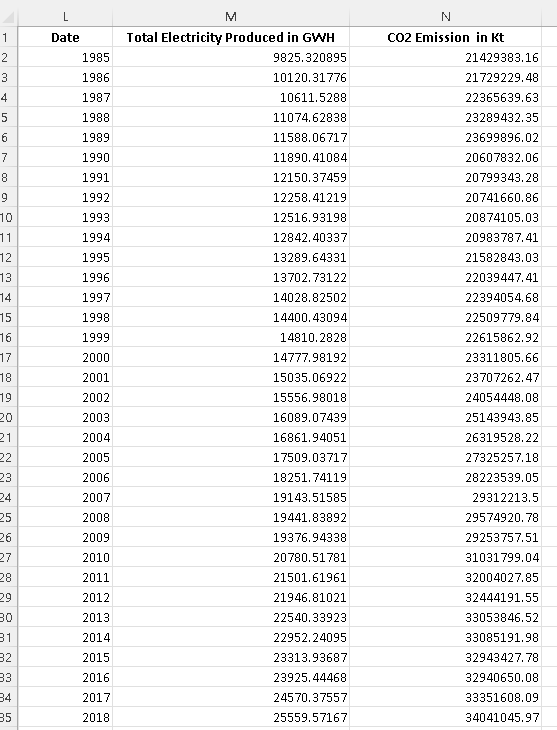
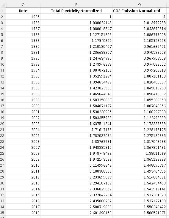
In the table below are shown the total electricity generated and CO2 generated in the world from 1985 to 2018 are shown below.(All Data from data.worldbank.org).
The complete data set of 7303 rows may be downloaded at
electricity generated and CO2 emitted and may be copied, pasted and used.
a) Normalize the data values of both the electricity and CO2 by dividing all values by the values in the first row.
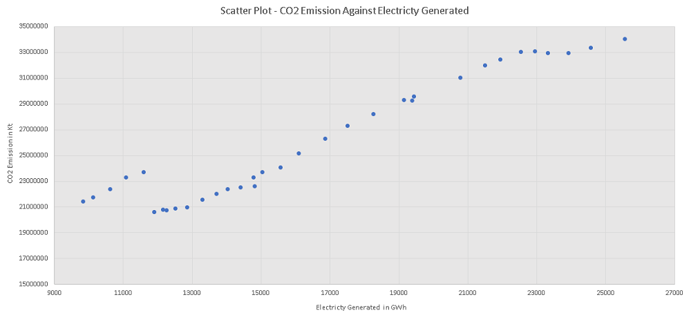
b) Use any software to make a scatter plot of CO2 emission against total electricity generation.
d) Use any software to calculate the correlation \( r \) between CO2 emission and total electricity generation.
Solution Problem 6
a)
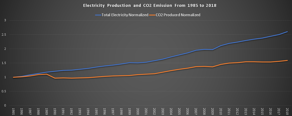
The above data normalized and its graph is shown below. From 1990 to 2009, the rate of increase of the electricity generated and the CO2 emission seems to be close.
The graphs of the normalized data is shown below. From 1990, both the electricity generated and the CO2 emission increases steadily but at slightly different rates. From the year 2009, the CO2 emission slowed down slightly.
b)
The scatter plot of the CO2 emission against the electricity generated is shown below. The graph is not close to linear.
c)
The correlations were calculated , using Excel , and the results are shown below.
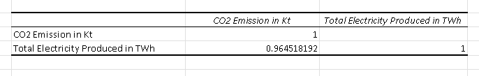
The correlations are:
Correlation between CO2 emission and the total electricity generated is equal to: 0.964518192
A quite strong correlation exists between the CO2 emission and the electricity generated knowing that a large part of the electricity is generated from coal, oil, gas ,... which emit large quantities of CO2.
More References and links
- Correlation Coefficient Examples with Solutions
- Calculate Correlation Using Excel
- Mansfield Merriman, "A List of Writings Relating to the Method of Least Squares"