Simple Linear Regression Examples with Real Life Data
Table of Contents
Simple linear regression examples with real life data are presented along with their solutions.
Example 1 - Apple stock and the Nasdaq Index
The data set in the table below represents the monthly Apple stock price (in US dollars) and the Nasdaq index from 2/1/2015 to 1/1/2022.
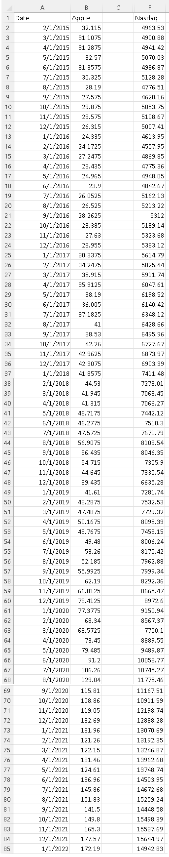
which could be downloaded as
Apple and Nasdaq and copied and pasted one column at the time in either Excel, Google sheets, LibreOffice and used.
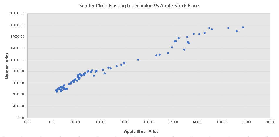
a) Use any software applications such as Google Sheets, Excel, LibreOffice .. to make a scatter plot of Nasdaq index versus Apple stock price.
b) Use any software to find the coefficients of the simple linear regression model of Nasdaq index versus Apple stock price and the coefficient of determination .
c) Use the results to write the linear regression model equation of the Nasdaq as a function of Apple stock price.
d) If we assume that the model above is valid for values outside the data range, what would be the Nasdaq index for the Apple stock price of \( 300 \) Dollars?
Solution to Example 1
a)
Excel was used to make a scatter plot of the "Nasdaq Index" versus "Apple Stock Price" and is shown below.
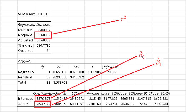
b)
Excel was used to calculate the linear regression model and the results are shown below.
The coefficient of determination is \( r^2 = 0.968387 \) meaning that \( 96.8387\% \) of the variability in the dependent variable "Nasdaq Index" is due to the variation of the independent variable "Apple Stock Price".
The coefficients involved in the linear regression model are:
\( \hat \beta_0 = 3376.873 \) and \( \beta_1 = 75.47172\)
c)
Using the the coefficients \( \hat \beta_0 \) and \( \hat \beta_1 \), and the variables \( Y \) representing the Nasdaq index value and \( X \) the Apple stock price, we can write
\( \hat Y = \hat \beta_1 X + \hat \beta_0 \)
Substitute \( \beta_0 \) and \( \beta_1 \) by their numerical values given by Excel calculations, we have
\( \hat Y = 75.47172 X + 3376.873 \quad (I) \)
d)
Use the linear model (I) above and substitute \( X \) by 300 to find the approximate predicted value \( Y \) of the Nasdaq as follows
\( \hat Y = 75.47172 \times (300) + 3376.873 = 26018.389 \)
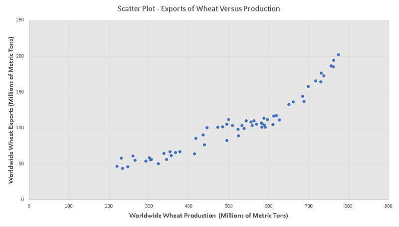
Example 2 - Wheat Exports and Production
The data set in the table below represents the wheat worldwide production and exports.
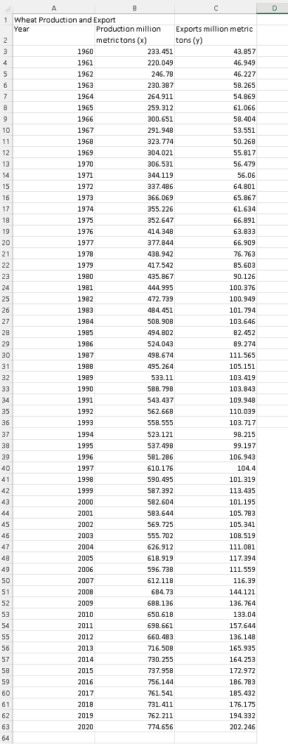
which could be downloaded as
Wheat Production and Exports and copied and pasted one column at the time in either Excel, Google sheets, LibreOffice and used.
a) Use any software applications such as Google Sheets, Excel, LibreOffice .. to make a scatter plot of the exports versus the production.
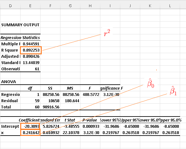
b) Use any software to find the simple linear regression model of exports versus production as well as the coefficient of determination .
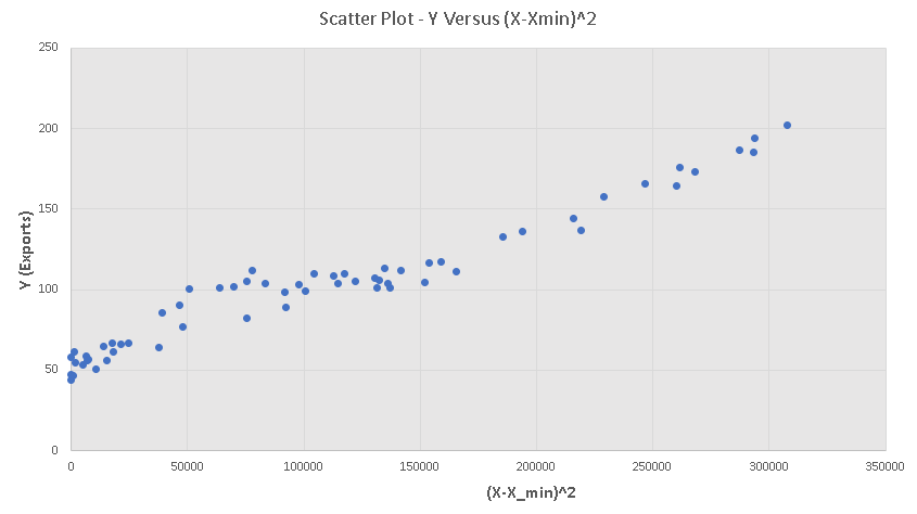
c) Note that the scatter plot is not linear but is closer to a quadratic function graph. Let \( X \) and \(Y \) be the production and exports respectively and \(X_{min} = 220.049 \) be the smallest of the production values given in the table.
Create another scatter plot of \(Y \) versus \( (X - X_{min} )^2 \).
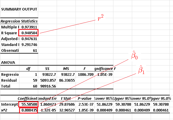
d) Use any software to find the simple linear regression model of \(Y\) versus \( (X - X_{min} )^2 \) as well as the coefficient of determination .
e) Compare the coefficient of determination of the results in part b) and d). Which one gives a coefficient of determination and hence is a better model?
f) Use both models in b) and d) to approximate the exports when the production is equal to \( 716.508 \) millions of metric tons.
g) The exports for a production of \( 716.508 \) millions of metric tons is given in the table and known to be \( 165.935 \) metric tons. Calculate the error for each model.
Solution to Example 2
a)
Excel was used to make a scatter plot of "average page engaged time (y)" versus the total "average pageview duration (x)" as is shown below.
b)
Using Excel for simple linear regression , we obtain
c)
We now proceed with a change of variable and make a scatter plot of \( Y \) versus \( (X - X_{min} )^2 \) and the results are shown below. The scatter plot is close to linear.
d)
Using Excel for simple linear regression \( Y \) versus \( (X - X_{min} )^2 \) , we obtain
e)
The coefficient of determination of the model in part b) is equal to 0.892253 while the coefficient of determination of the model in part d) is equal to 0.948504 and is higher which suggests that the model in parts c) and d) might be better than the model in part a).
f)
Let \( y \) be the exports and \( x \) be the production
Model (I) in parts a) and b) may be written as \( y = 0.241642 x - 20.3093 \)
Model (II) in parts c) and d): \( y = 0.000435 (x - 220.049 )^2 + 55.58508 \)
For a production of \( x = 716.508 \)
model (I) gives: \( y = 0.241642 \times 716.508 - 20.3093 = 152.82912 \)
model (II) gives: \( y = 0.000435 (716.508 - 220.049 )^2 + 55.58508 = 162.80019\)
g)
Error in model (I) is equal to: \( 165.935 - 152.82912 = 13.10588 \)
The error in model (II) is equal to: \( 165.935 - 162.80019 = 3.13481 \)
The error in the model of parts c) and d) where a change of variable was used gives a smaller error and this example has shown that changes in the definition of the independent variable might improve the mathematical model.
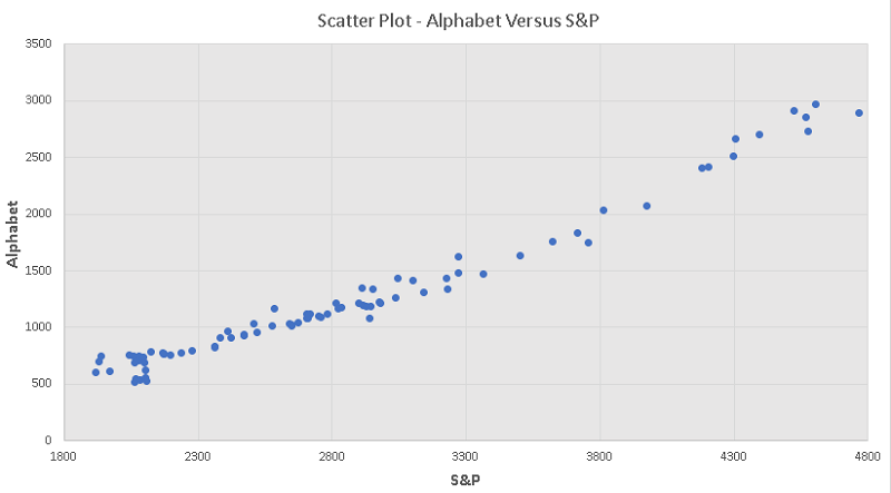
Example 3 - S&P Index and Alphabet Stock Price
The graph below is the scatter plot of the alphabet stock price versus S&P index from the period 2/1/2015 to 1/1/2022.
The data used for the scatter plot could be downloaded as
S&P and Alphabet and copied and pasted one column at the time in either Excel, Google sheets, LibreOffice and used.
Note that from the lowest value of the S&P to about an S&P equal to 3300, the scatter plot is close to linear. From an S&P higher than 3300, the scatter plot is also linear but with a higher slope. This change in the slope of the scatter plot seems to be due to the stock market crash of March 23, 2020 due to the pandemic.
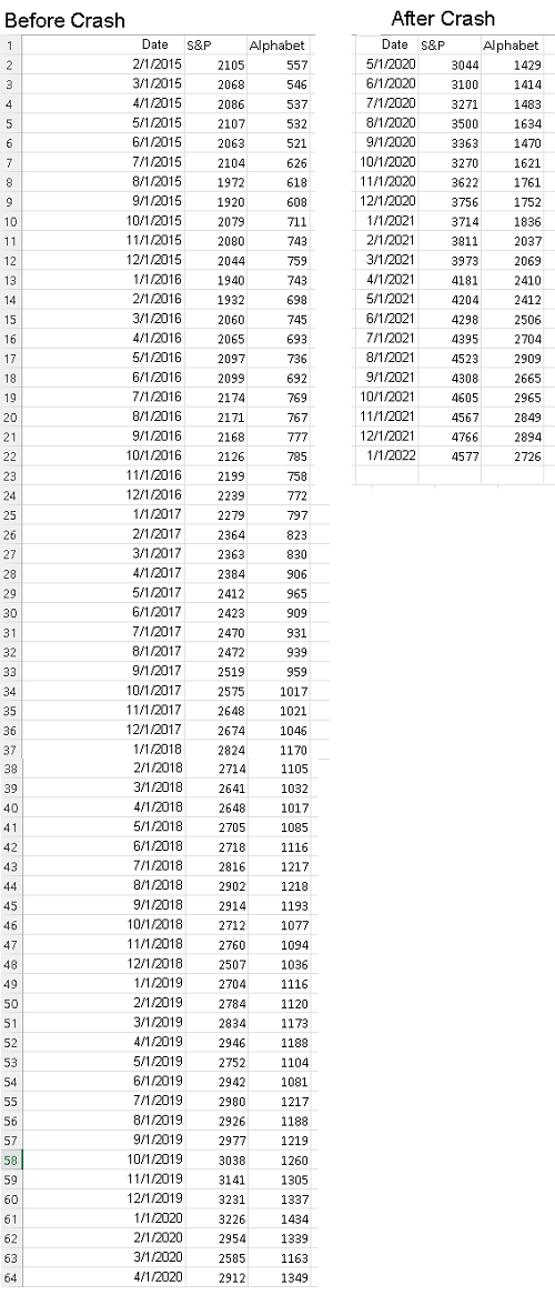
The data below is the same data whose scatter plot is shown above but has been split into two datasets: data before the crash and data after the crash
and may be downloaded at
S&P and Alphabet data split.
a) Use any software applications such as Google Sheets, Excel, LibreOffice .. to make a scatter plot of the alphabet stock price versus the S&P before and after the crash.
b) Use any software to find the simple linear regression model of alphabet stock price versus the S&P as well as the coefficient of determination and the slope of the linear model, which is \( \hat \beta_1 \) for each data sets before and after the crash.
c) Compare the slopes of each dataset found in part b) above
Solution to Example 3
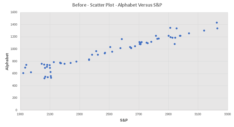
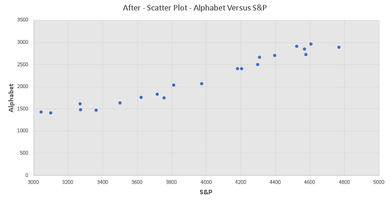
a)
Excel was used to make a scatter plot
Before the crash
After the crash
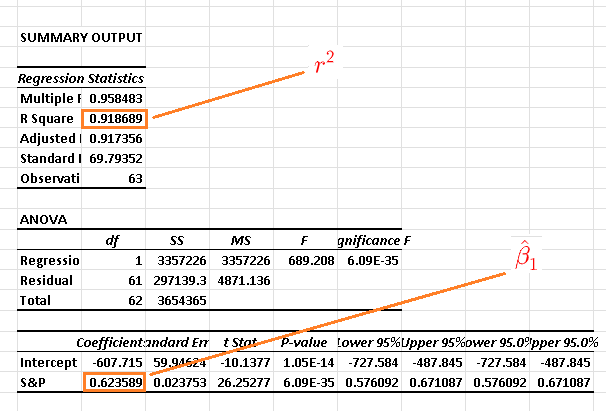
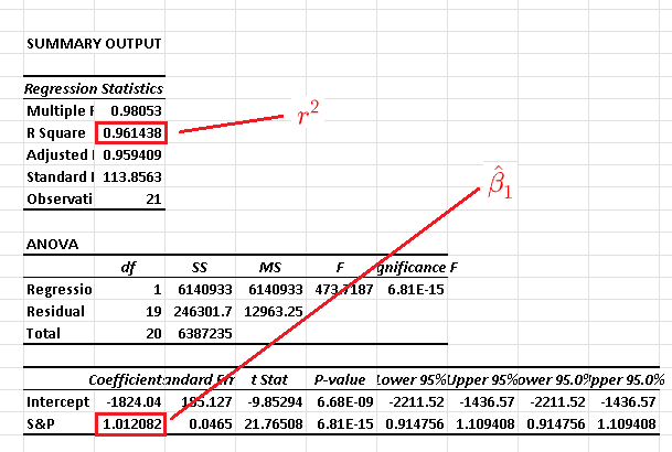
b)
The use of Excel for simple linear regression for each data set gives the results:
1) Before the crash: The coefficient of determination is \( r^2 = 0.918689 \) , the slope of the linear model is \( \hat \beta_1 = 0.623589 \)
2) After the crash: The coefficient of determination is \( r^2 = 0.961438 \) , the slope of the linear model is \( \hat \beta_1 = 1.012082 \)
d) The slope \( \hat \beta_1 \) after the crash is higher and that means the Alphabet stock price was increasing faster after the crash.
More References and links
- Multiple Linear Regression
- Simple Linear Regression
- Simple Linear Regression Using Excel
- Multiple Linear Regression Using Excel